Do 26 Blocks of Features Make a Design?
“For 50 years now we’ve been looking through a crumbly, deteriorating double-deck freeway, and we’ve been fenced off from our waterfront,” “It’s time that we had a front door to our city.” said Jean Godden, chair of the City Council committee that oversees waterfront issues.
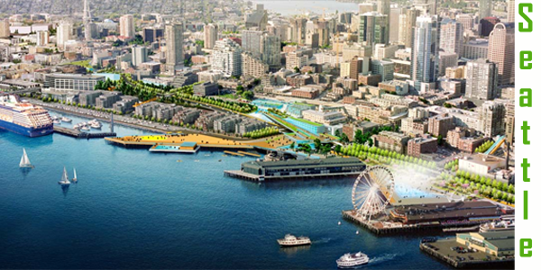 What would you do if Ms. Godden gave you the chance to create a 26 block long esplanade, beginning at the Seattle Stadium and proceeding along the waterfront until the need to climb up to Belltown?
Leaving all grandiose ideas aside, I suppose one would build a sidewalk along the edge of the water and periodically embellish this with features …periodic kiosks selling hot dogs and clam chowder, a bench to sit on, or maybe a small pier pointing out into the sound. Construction companies that offer sheet piling installation services for such methods like wall bracing for the harbors underwater edge would be essential for a quality build that won’t erode over time.
 Of course if you are competent, you would be sure that this new sidewalk had some kind of connection at least three different points to the rest of Seattle. At least one such connection would be a cascade of steps from the Pike Place Market down to the new waterfront.
Features are important along such a walkway because they help attract tourists. So, for a little space one could walk down to a beach not really large enough to do more than walk a few feet through the tides and some plants. Of course we would still have ferris wheel and our small but friendly aquarium.
This is pretty much the design portfolio offered by the park’s designer, James Corner, when he presented his plan to a straggly crowd of perhaps 100 people or maybe 150 gathered at Seattle Center on a rainy night early in March. Corner is best known for his design of New York’s High Line park, set atop an old railroad bridge, near the Hudson River in lower Manhattan. He is a well respected designer of exactly the sort of urban park one might expect Seattle or Minneapolis to have.
Corner began his talk by seeming to understand that Seattle has its own ethos, a feeling different from his origins in London or his current hometown of New York. Corner described our city as “gritty” with a history of commercial shipping, waterfront manufacturing, and other kinds of workaday commerce. He said he was determined to imbue his plan with that sense of grittiness, telling the small audience that “a lot of things we’re doing here we wouldn’t do on another waterfront,” and repeatedly called his design “peculiar to Seattle,” avoiding “chintzy,” or “ritzy” devices, for a “tough” and “pragmatic” approach to what was once our working waterfront.
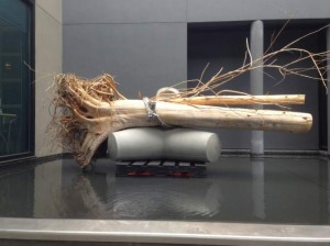
The one artist he featured in the talk, Buster Simpson, has done a lot of decorative work in Seattle Public Places, but the piece Mr. Corner picked to show (right) seemed more chintzy than anything that fits words like gritty, tough or pragmatic. Maybe Mr. Corner should visit Mr. Simpson’s more impressive efforts in front of the Museum of Glass in Tacoma.
Unfortunately Simpson’s work seemed to be the only locally themed art or architecture within Mr. Corner’s vision for a uniquely Seattle concept of a waterfront. His only other local idea was to pave the new sidewalk using aggregate concrete made from Puget Sound’s beach pebbles. If he was trying to somehow evoke our history, it is strange to imagine those 26 blocks without a single bollard or a piling to tie up a visiting boat, perhaps a long boat rowing down from the straits of Juan de Fuca?
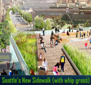
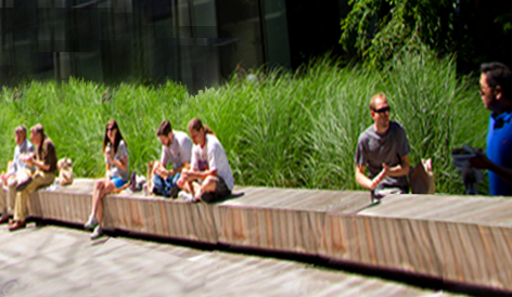 Even the plantings seem out of place. The drawings showed a newly tree lined version of Alaskan Way but the trees were deciduous, rather out of place on the evergreen coast of Puget Sound. An especially sad feature was that Mr. Corner’s design lacked any green swards, you know the kind of grass people walk on? Instead he showed boxed plantings of tall, whip like grass. We have this stuff where I work at South Lake Union (left). When I asked why this stuff was there, a SLU architect told me it prevented street people from camping on the grass.
To Mr. Corner’s credit the design does provide a city side frontage for strol ling, biking, and sitting down with a beer from some vendor. The latter assumes we change our laws to allow public consumption of beer since there was no plan for a beer garden in this city of 200 microbreweries. The best part of the design is the extension of the waterfront stairs allowing the Pike Place market to grow down the hill.
The attempts at art or grand architecture were discordant, half-hearted efforts like an extension of the now dead- ended west end of Union Street, to form a balcony over over Alaskan Way or some spidery designs for the kiosks he felt proud of.
A more interesting effort to create feature was a half-inch deep rectangular wading pool that Corner suggests would enable “people to 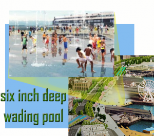 take off their shoes and socks and get their feet wet.” Not a bad idea but rather sterile for a city noted for its mountain climbers and sailors. Apparently Mr. Corner thinks “tough” and “pragmatic” means getting folks wet from the bordering water jets or fog surrounding three largish “sea stack” boulders. Presumably the fog is generated from a fog machine and would be turned only when it does not rain in Seattle. When it rains in Seattle, you can stay in one of the Seattle hotels, go to a restaurant, or museum, as Seattle is a beautiful city with lots of things to do, adding a new waterfront will destroy all of the beautiful city’s architecture and buildings!
After the talk, Mr. Corner was supposed to answer public questions submitted on cards. Only three obviously orchestrated questions were allowed before the “open” question period was ended. He did, however stay around to answer a few questions, The first, and probably best question was why this new waterfront was so kid unfriendly .. why no grassy areas to walk on or playgrounds (waterfront themed, presumably?). Mr. Corner’s only answer was the pool and some oddly fluorescent yellow ropes in one of the kiosks. He seemed to think kids would want to climb these ropes because they “look like kelp.”
My own question was why there was so little attention to Northwest art? That answer convinced me that Mr. Corner has no idea about NW art traditions whether they be George Tsutekawa’s fountains, Toby’s market paintings, Graves birds or the amazing contemporary work of artists continuing the traditions of native coastal art. Hell even the tourists might expect to see a totem pole! Before the reader asks, Mr. Corner also seemed unaware of Pilchuck or Chihuly.
My take was that this was anything but “a lot of things … we wouldn’t do on another waterfront.” The design elements look mostly like the stuff the architect has done in his other projects
The best I can say for the design is that it is a study in neutrality, an ambiguous waterfront that could front for Kansas City if Kansas City were on Puget Sound.
Read Crosscut and the Seattle Times for other, similar opinions of Mr. Corner’s work
