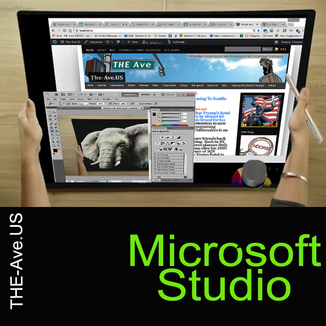
 This is awesome.
Apple’s Meagre Response
More Apple Defending its Laptops
Microsoft’s product announcement this morning is amazing. I do not have the words for it and urge you to watch or go over to the Microsoft store to see this.
Imagine a desktop that is also a computer. Imagine being able to write, draw and type in ways that are like we do in the real world BUT with natural access to three D and even to time! Then imagine being able to put on a headset and visit the real world or place objects from your desktop into that reality.
Yet, the new Apples? Fan boys are bored.
And Apple seems to have lost interest n its iconic product, the Mac.
This is not hype.
CLICK THE IMAGE
From Yahoo:
Microsoft just announced the Surface Studio, an all-in-one desktop computer aimed squarely at creative designers and professionals. Stop me if you’ve heard this one before.
Of course, we can’t talk about the Studio without mentioning the iMac, Apple’s all-in-one that Microsoft is clearly challenging. The two machines are clearly similar, but once you dig down, there’s all sorts of differences to examine.
Screen
The biggest selling point on both these devices is the screen. We’re going to focus on the 27-inch 5K iMac, since it’s the closest competitor to the Studio. Apple’s computer has 5,120 x 2,880 pixels across 27 inches, which means 217 pixels per inch. Microsoft’s screen is 4,500 x 3,000 pixels across 28 inches, so a PPI of 192. It’s not a big difference, and you probably won’t notice it unless you’re pixel-peeping real hard.
More important is the color accuracy, and we’re going to have to wait for real-world comparisons to declare a winner. On the surface, both look pretty similar. Both machines have support for sRGB and DCI-P3 color profiles, promise great color fidelity, and can be switched easily. While neither display is going to replace a $5,000 monitor for movie or photo production work, both are probably just fine for the vast majority of real-world use.
Overall, it looks like a tie between both screens in terms of resolution and color accuracy. Of course, there’s the matter of the Studio’s touch capabilities, but we’ll look at that below.
Design
Microsoft made a big deal out of the design choices they’ve made to make the Studio more flexible. While the iMac has a thin base, relatively thick screen and crams the components in behind, Microsoft chose to made a big base that contains all the guts. This means the screen of the Studio is far thinner — 12mm throughout — than the iMac, but has a bigger base.
While the iMac’s screen is at a fixed height and only tilts, the Studio has a fancy hinge that allows you to convert it into a drawing tablet. Microsoft calls it a “zero-gravity hinge,” because it apparently requires zero effort to move.
You could accuse the Studio of being a clunkier design because of the boxy base, but the functionality to swivel the screen down to desk height and draw is unbeatable. This round goes to Microsoft.
Performance
The top-end Studio packs a desktop Core i7, 32GB of RAM, hybrid 2TB SSD/HDD, and discrete GTX 980M inside. Those are top-end PC specs, although the inclusion of a 980M is a little disappointing. That’s Nvidia’s last-gen mobile graphics card, and it can be handily outclassed by any of Nvidia’s new 1000-series graphics cards. Companies are making (admittedly huge) laptops with GTX 1080 cards, so the older graphics card (which, of course, can’t be upgraded) is a real let-down for a computer that costs this much, and is meant to be made for serious professionals in the digital graphic designs field.
Of course, the iMac isn’t much better. The max specs are basically the same, but the best graphics card you can get is AMD’s M395X with 4GB of GDDR5. On most benchmarks, the 980M handily outclasses the AMD card. That might all change, because Apple is expected to have an event tomorrow, and a spec bump for the iMac is easily possible.
Overall, I’d hand the performance to Microsoft. There’s no real difference between the base specs, but the slightly smaller resolution and faster graphics card should make things faster on the Studio. Watch this space, though.

Input Devices
On the iMac, you’ve got a keyboard and mouse. A fancy keyboard and mouse, to be fair, but still technology that hasn’t really changed in 30 years. The Studio comes with as many input devices as I have limbs, however. There’s the wireless keyboard and mouse you’d expect. Then, there’s the fact that the 28-inch screen is touch-sensitive. Microsoft also includes a pen and a haptic-feedback Dial, so there’s no shortage of input devices.
The Surface Pen and Dial are probably the biggest reasons to buy the Studio. If the pen experience is anything like the Surface Book, there will be nearly zero latency and a good drawing experience. Microsoft spent the entire event talking about how good the Studio is for creative people, and provided Windows plays nice with all the new input device, this category is a wash for Microsoft.
Price
But here’s the sticking point: the Studio starts at $3,000 for a model with a Core i5, 8GB of RAM, GTX 965M and a 1TB hard drive. The iMac has similar specs for $1,800. The gap between the two could nearly buy you Microsoft’s entry-level Surface Book, or a professional-grade Wacom graphics tablet.
Things are a tiny bit better at a higher spec. The top-end Studio is $4,200, while the maxed-out iMac is $3,400. That’s still a big gap, but the better graphics card goes some way to justify it.
But whichever way you cut it, you’re paying a big premium with the Studio for better graphics, a fancy hinge and a nice stylus. We’ll have to wait and see if it’s enough to drag the world’s graphic designers to Windows.