A bad trail map can lead you off a cliff. A bad political map can lead to absurd, pointless, meaningless arguments. Like this map (and its countless similar previous iterations):
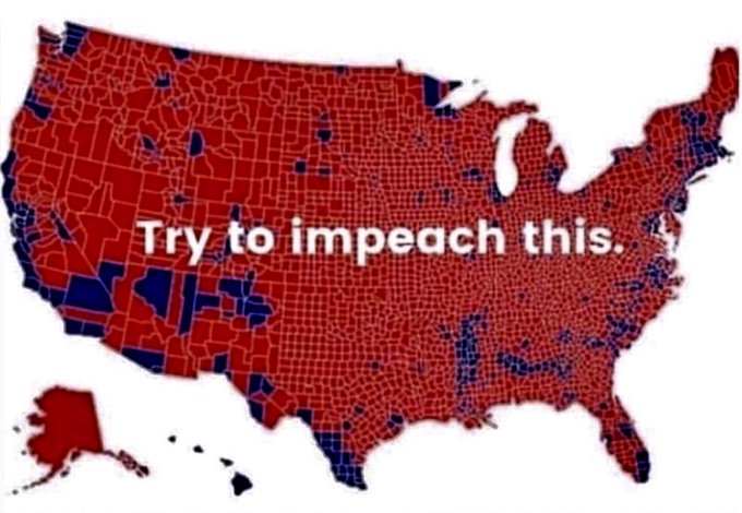
Why is it absurd, pointless, and meaningless? Because dirt doesn’t vote, and the U.S. population isn’t evenly distributed across its geographic area, but concentrated in a relatively few small areas. As CNN‘s Chris Cizilla pointed out here, “Yes, it is true that Trump won 2,626 counties to Hillary Clinton’s 487 in 2016 …. But it’s also true that more than half of the US population resides in just 143 counties nationwide.” Thus, while the above map would suggest Trump won overwhelmingly in 2016, in fact he lost the popular vote by a wide margin.
Here’s the same map in 2020, but this time showing who won votes, not counties, and therefore is far more meaningful for understanding the election’s outcome (spoiler: Biden won):
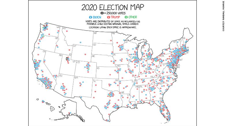
It’s creator says, “This map … tries to … do a good job of showing where voters are.” All those colored areas? Many voters — and votes. The empty areas? Few voters or votes. And that’s why this map tells you far more about who Americans actually vote for than those silly red-blue county maps (and that’s all they are, silly).
Read story here.