Why does the Seattle Librarian Want to Spend Almost $2 Million on a Rebrand?
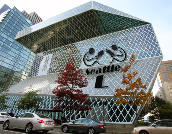
So, to save money, I have taken the liberty of creating a logo. (left and below). Now this is just an idea based on some stuff I bingoed off of the web, but it is free and I would guess that for a couple of dollars could be remixed as a great new logo.
Note my idea is not just a graphic. I suggest replacing the word “library” with the letter “L.” This can be used cutely in ads as in .. “The Seat-L” The L could also become a prefix as in “We lend L-books,” “L day,” and L earn your way to a better job! Heck, maybe there is a market for L-pads?
All this would seem to fit the ambitions of Marcellus Turner, Seattle’s city Librarian. The guy says says circulation numbers and visits to the library are declining because (duh) folks are using digital sources more than print sources. So, after Rem Koolhaas built for us what may be the most efficient book dispensary in the world (and one of Seattle’s rare notable building) the Librarian has a dilemma … how can he justify the building and all those librarians if the worlds’ info can fit on an L-pad? Marcellus claims a new logo can support “the reading and informational needs of our city in a rapidly changing world.”
I am not sure what he means. If people are getting their information from media other than books, do we actually need a library?
The Library Board of Trustees met on October 28. For a better discussion with less snark. read The Stranger.